The Premier’s Priorities represent the state’s commitment to improving quality of life for NSW citizens.

Aiming to tackle many of the issues puts in the ‘too hard’ basket – including education, environment and health – all initiatives are important, but also very different.

Services

  • Name Concepting
  • Identity Concepting
  • Brand Narrative
  • Roadmap Workshop
  • Strategic Report
  • Communications Approach
  • Marketing Plan

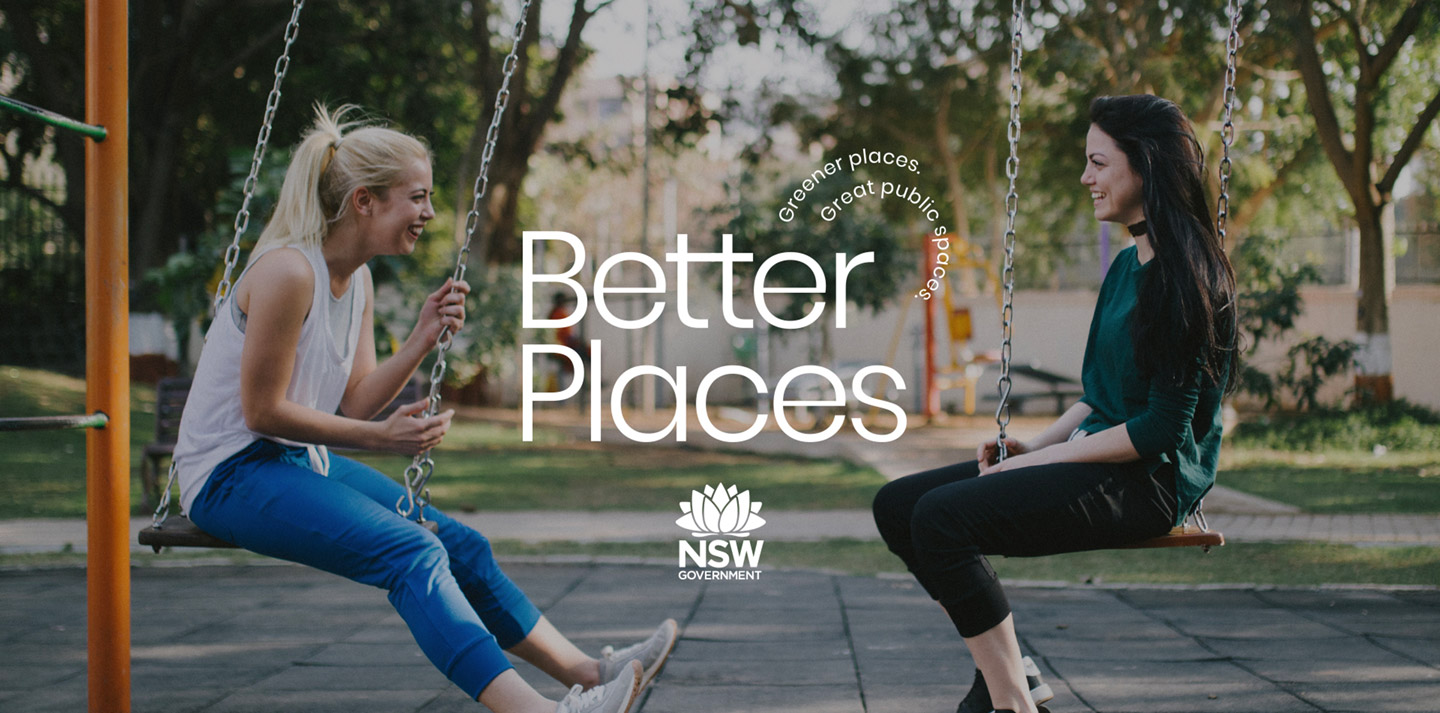
Seeking to unify the objectives of the Premier’s two environmental Priorities – Greener Public Spaces and Greening Our City – the DPIE employed The Being Group’s strategic and creative teams to develop one campaign concept.

More than an identity, this concept was to ignite a movement.

Developing a name for the concept presented many challenges, primarily due to the political, cultural, psychological and linguistic considerations of a state-wide project. After brainstorming and shortlisting four names, Better Places was presented for its scalable application to any improvement; adding a bench, tidying a laneway, building a playground or planting a tree can all make a place better.

Following naming, six of The Being Group’s designers submitted a total of seven identity concepts for internal consideration. Four design concepts were selected for stakeholder presentation, each highlighting different objectives of the campaign: communities for change, celebration of the Australian landscape, ease and simplicity, and growing a movement.

This initial process fed into a strategic roadmap workshop conducted at the DPIE’s offices. Presenting to representatives from the Public Spaces and Green and Resilient Places divisions, the workshop escalated testing of a draft strategy, name and identities to accommodate time pressure on the two Priority projects.

Focusing on accessibility – an element essential to government projects – the preferred design concept presents a simple, legible, future-proof logo. Employing a circular tagline to evoke totality, the slogan can also appear in other configurations or enlarged for increased comprehension.

Secondary elements comprise custom icons, with shapes signifying environmental, social and emotional themes. Bright, minimal and friendly, icons can be layered to create landscapes, imply conversation or simply build visual interest. The versatility of the iconography extends further, with the ability to create an infinite number of repeat patterns.

Large and small-scale applications feature layered, eye-catching elements. Collateral plays on the government’s desire for seamless integration by extending text beyond the frame. Highly scalable, the identity can be ramped up or toned down – providing a defining look and feel for initiatives without a brand, while allowing pre-branded initiatives to shine.

The website serves as the symbolic home to Better Places, with featured hero slides positioned to maximise real estate. Initiatives stack into a single, rich tapestry under the overarching program, conveying hierarchy through size and placement, and demonstrating the broad range of community projects undertaken by the DPIE.

Digital content integrates graphic language in a playful way, combining iconography with diverse imagery of people and places. Bright, inspiring and actionable, social and application designs encourage communities to become more involved with the spaces around them.

Merchandise applications vary depending on demographic, spanning government, communities, schools and public spaces. Integrating brand icons to make different statements, concepts are bright, inclusive and approachable to all.

After workshop discussion and modification of the preferred concept, a strategy document was developed to outline context, opportunity analysis, brand identity, perception, and target markets for varied internal stakeholders. A 12-month communications pipeline was delivered alongside this strategy, highlighting key channels, dates and events to guide the movement for a year in advance.

To give life to the two Priorities, ensure community participation and create ongoing momentum, suggested messaging was informed by target decision-making styles – data-rational, emotive, pragmatic or holistic – with an emphasis on collective impact over individual action.

Engaging graphic elements from the evolved campaign concept, the revised Premier’s Priorities initiative retains the identity’s aim to connect communities. Though restrained, the DPIE’s internal brand adjustment demonstrates the overall success of the strategic process in developing a united concept, aligning internal divisions, and achieving a swift ‘win’ through the development of a joint digital presence.

I wanted to thank you for all of the work The Being Group completed that helped us to get this far. Thank you for such a great result and all of your hard work!

Vanessa Gordon
Director: Place Team, Department of Planning, Industry & Environment

Ready to start
a project?

    • I'm interested in
    • How did you hear about us?